Bakery Logo (done with the book, Graphic Design for Everyone).
The Main Purpose:
Sell baked goods.
To invite wholesome community members.
Have game mornings.
Deliver bread.
Personality:
Progressive.
Friendly.
Full of surprises.
Who are they trying to attract?
Artists.
Parents.
Young and hip.
Students.
Early career workers.
This is a mind map elaborating on what the bakery does, what the customers are like, keywords describing the bakery and what makes them stand out. I the bakery would be catering to free-thinking, artistic customers that were conscious of community. The baked goods would be made with the finest organic ingredients.

How do they want people to feel about the business?
The store should be a refuge from the stress of life.
It offers comfort food.
There is a good connection with kind people.

This is a mood board showing the type of people the bakery would attract. It displays the personality of the brand and the intended age group. The colors of the logo are listed, which I adjusted later on. The typefaces are listed as well.
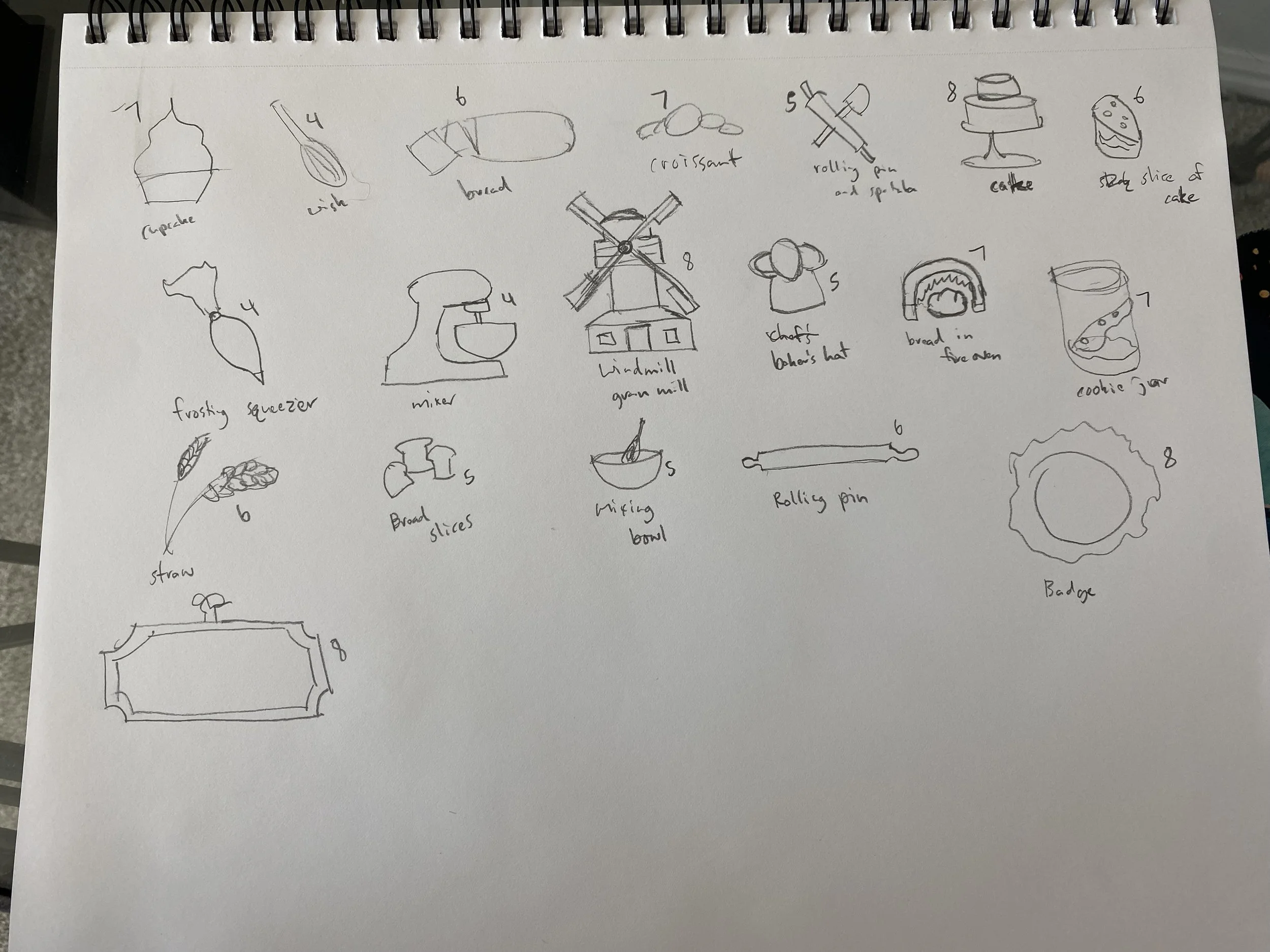
I got some ideas from bakery vectors on the internet to draw. I needed a central symbol of some sort to have in the center of one of my logos. I played around the the idea of having a sign shape be one of the logos and a badge for the other with the symbol in the middle of it.
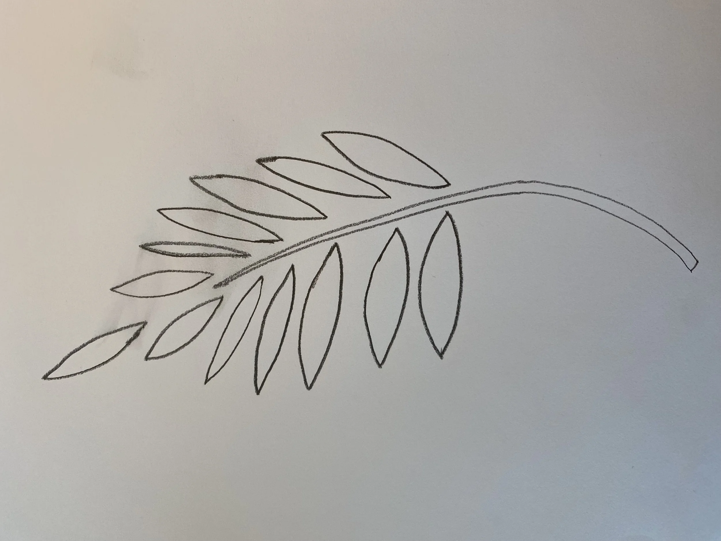
The first logo is in a sign shape with the name of the bakery in the middle. I wanted it to be old fashioned and ornate. The typefaces I used was Filmotype Zanzibar and Bento Sans Thin. I designed the wheat vectors in illustrator.
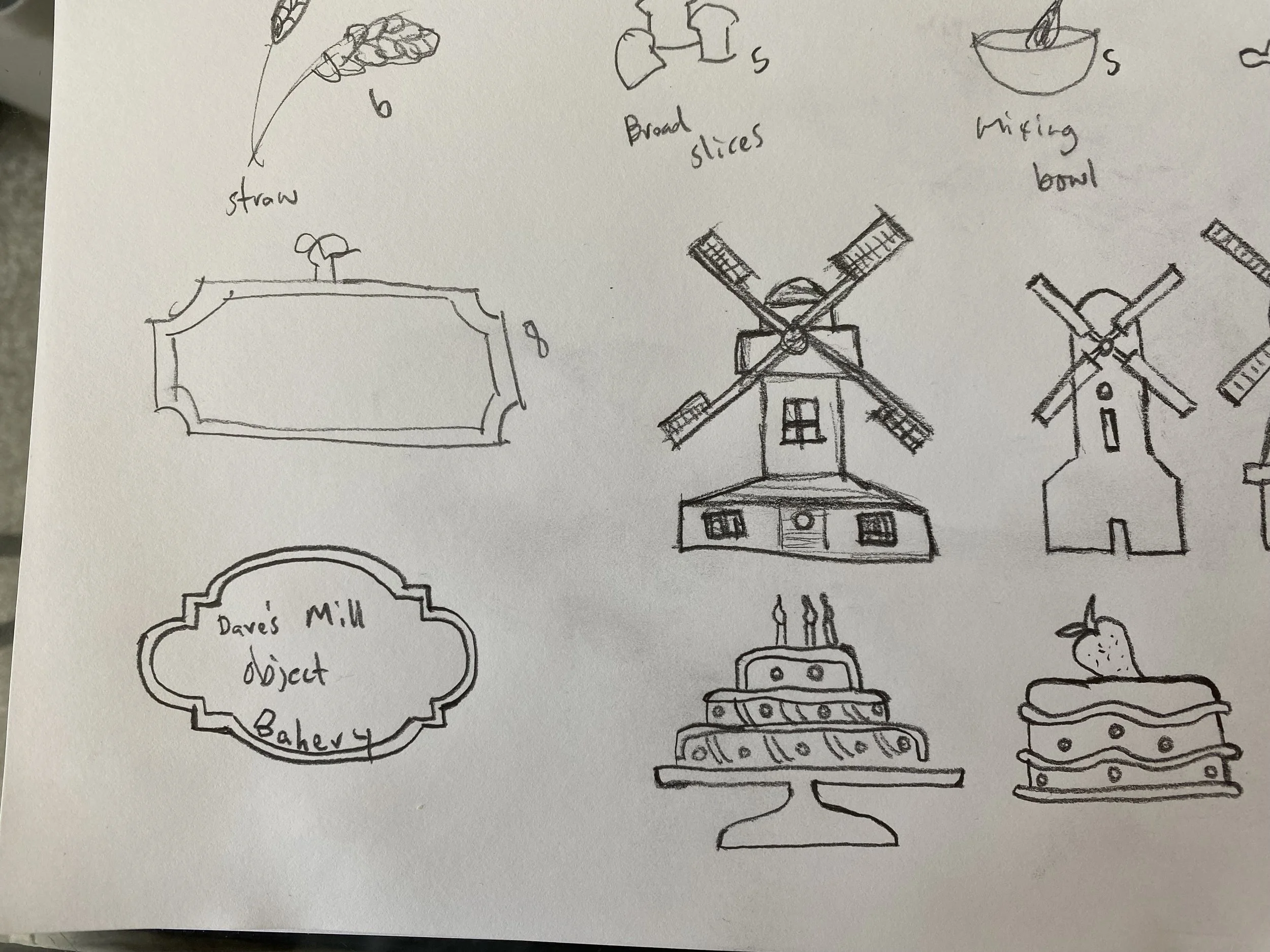
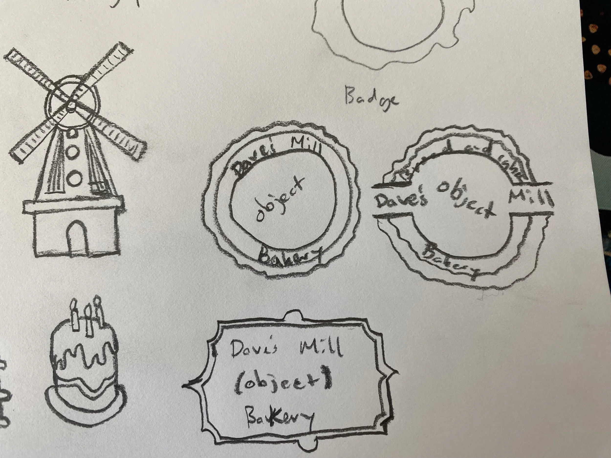
For the second logo, I created the grain mill vector in illustrator and put it in the center. I created a badge for this one and had the name of the bakery circling the grain mill. The typeface I used for this one was Sherly Kitchen Regular.