Project Overview
The Product:
This is an app and website that I used to show information about exhibits, the museum, and the booking process of an art museum.
Project Duration:
November 2023 - December 2023.
Project Overview
The Goal:
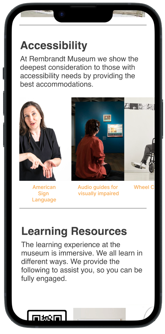
Our art museum will let users connect with assistive resources, which will affect Christina by enabling her to have the full educational experience through the means of ASL and reading content. We will measure effectiveness by seeing how many people will sign up for assistive resources.
User Research: Summary
I asked what assistive resources my users would like to see in the app and website. They said they would like to know if the museum has placards. They would like to take advantage of audio tours and interactive exhibits. QR codes would be helpful as they would provide extra information. Some said they would want the hours explained. One user said he wanted to know if there were curators. Does the design of the building complement the artworks?
I had the assumption going in that most people would just want to look at the paintings without extra learning media. I never considered that people would worry about the design of the building and whether it is cohesive with the artwork.
User Research: Pain Points
Lack of Information:
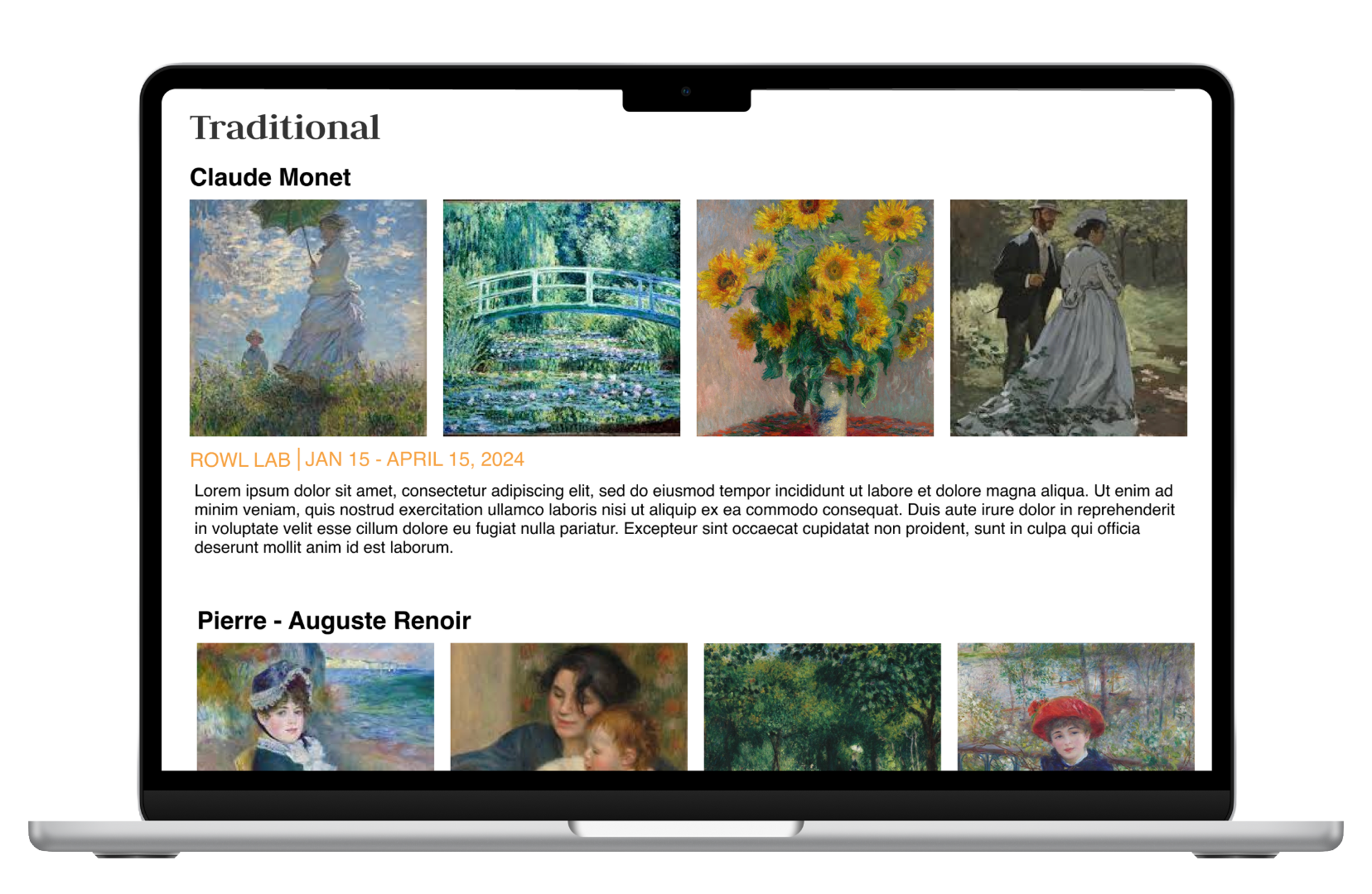
A user said that there wasn’t enough information accompanying the paintings. I found a way to show options for extra learning supplements.
Design of the Building:
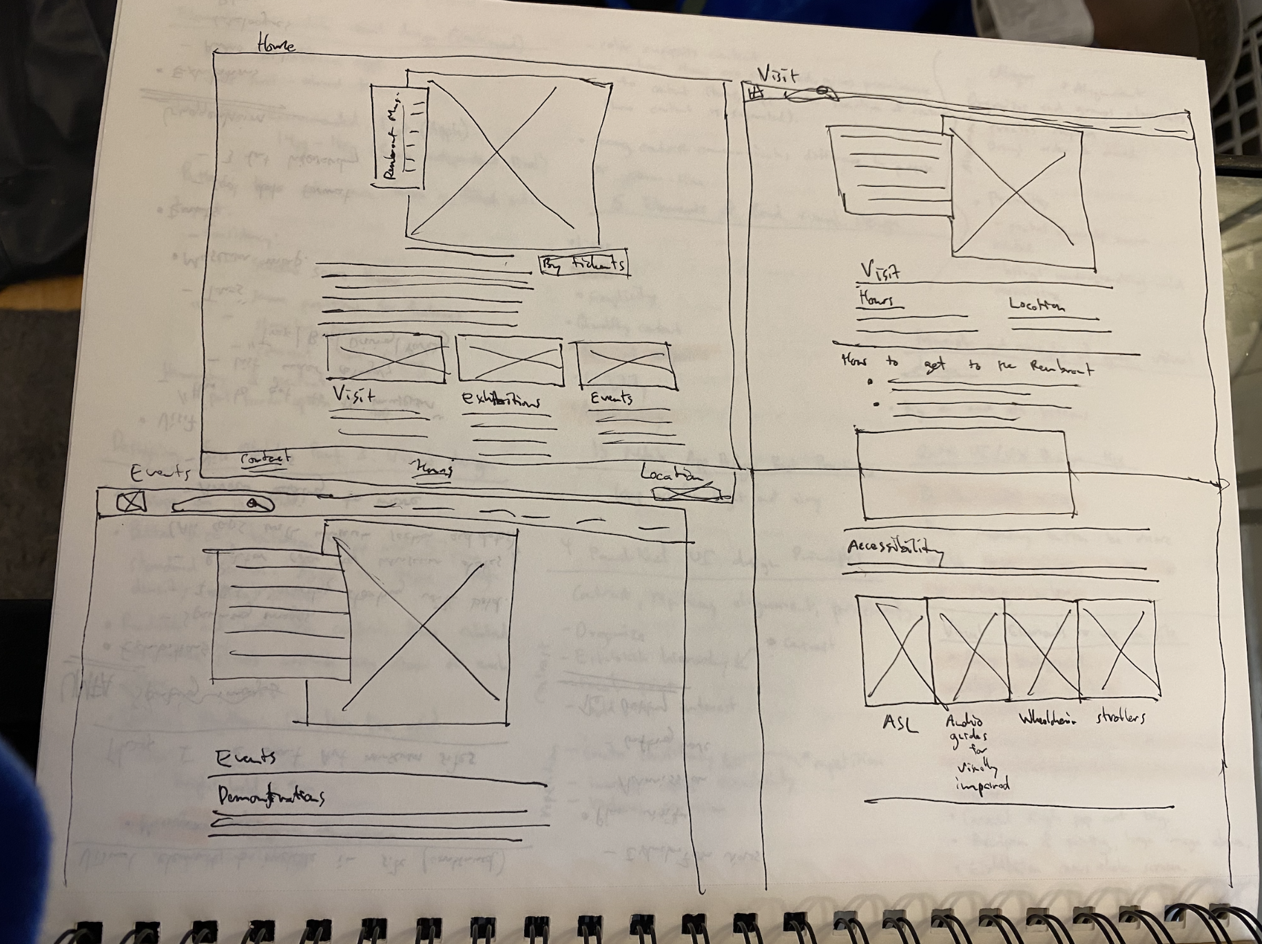
One user said the layout of the museum was difficult. I found a way to show a blueprint of the building.
The art can be too abstract:
A user said contemporary art can be too esoteric. I will include descriptions of the art in the app.
Multiple users said they would like to know about hours:
Plenty of users were wondering how they can fit going to the museum into their schedules. I will put information about hours as the first thing in the app.
Persona: Christina

Problem Statement:
Christina is an American Sign Language teacher who needs to use an app that can connect her with assistive resources for the art exhibition since she has a hearing deficit and wants to be as informed as other visitors.
Frustrations:
Frustrated by the layout of the museum.
Frustrated that only the painter and title of the painting were by each art piece and not a description of the painting.
Galleries need more context and educational materials.
Some art galleries don’t have interactive QR codes.
Christina’s User Journey Map
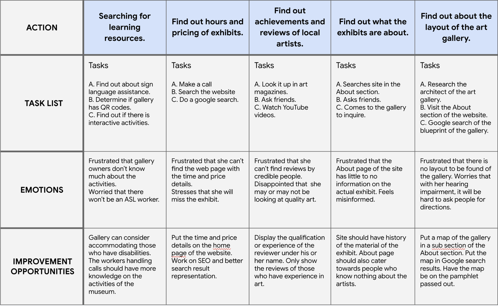
(Tilt to view in mobile)
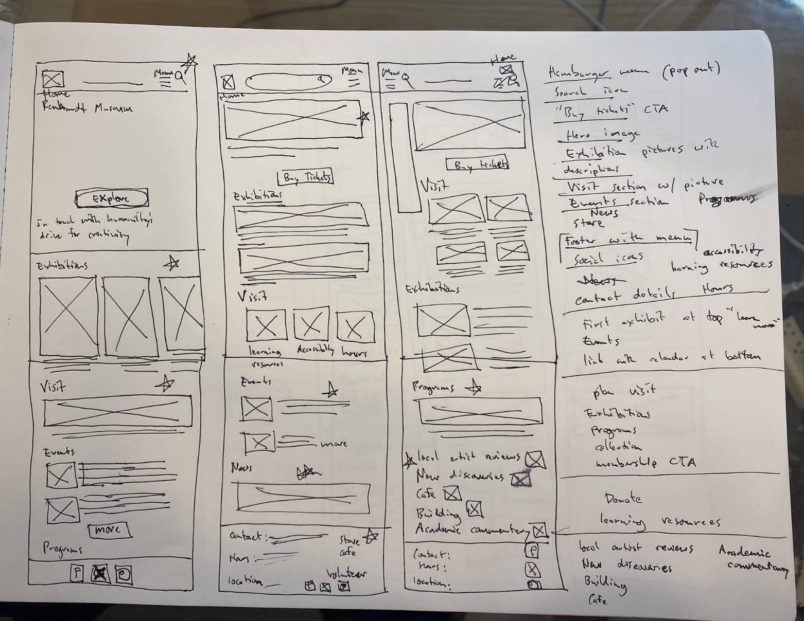
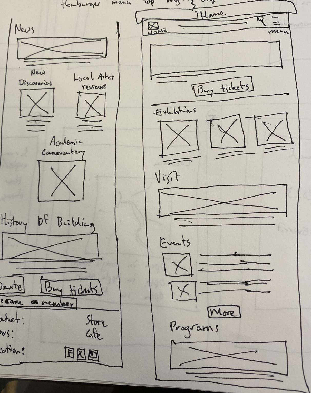
Paper Wireframes